Fixed-width template, should we stick to it or give up for 2%?
When choosing a web template, the first consideration is naturally personal aesthetics—some people prefer flashy designs, while others like simplicity. The second consideration is layout—whether to go with two columns or three. In fact, in today’s world where user loyalty is increasingly low, the information capacity of the homepage is also an important factor to consider. Choosing a wider template allows more information to be displayed on one page, enables the use of larger and clearer fonts (even if you don’t have much content), and accommodates bigger images without disrupting the layout. Currently, all images on my blog must be resized to a width of 480 pixels or less; otherwise, they will stretch into the sidebar on the right. A template with a width of 1024 pixels offers 25% more display area compared to one with a width of 800 pixels. When many Digg-like websites are racking their brains to figure out which topics can make it to the front page, why not take advantage of this extra homepage space for your own blog?
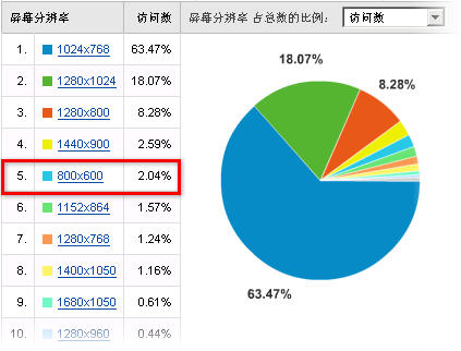
According to the GA statistics mentioned above, users with a browser resolution of 800 pixels account for 2%. This means that if I were to adopt a wider web template, I would need to disregard the browsing experience of these 2% of visitors. I tested it, and by default, the sidebar almost disappears—it requires additional scrolling to the right to be visible. Over time, this could result in losing these 2% of visitors. Of course, since my blog has a small audience, it doesn’t matter much. However, for popular blogs like "Xiaozhong Software," this might be something to consider. Xiaozhong uses the same glossy template.
In summary, adopting a wider template increases the information capacity and enhances the overall visual experience but may sacrifice the browsing comfort of users with lower-resolution screens. Bloggers need to weigh the trade-offs based on their audience's characteristics.