The Evolution of Google Logo Design
by zfreet on 2008-02-19 13:02:13
Google has always been renowned for its simplicity. Looking at Google's current products, they consistently maintain this style. However, by examining the evolution of the Google logo, it's clear that Google once experienced confusion, flamboyance, and even imitation...
Below, let’s take a look at how this classic logo, which uses the three primary colors of red, yellow, and blue, evolved over time.
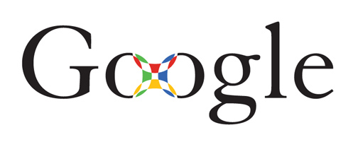
1、The initial design already incorporated the concept of the three primary colors, but the basic lettering color remained the mainstream black, with the primary colors used for patterns. However, the meaning of the pattern in the middle wasn't clear.
