After 25 years, Microsoft changes its company logo: to bring a fresh feel

by geekzhang on 2012-08-24 09:06:21
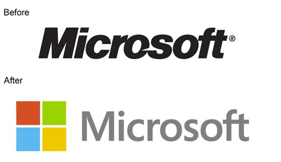
The Seattle Times reported that Microsoft has used a square, thick italicized logo since 1987. It will change its logo, and the new one will be more colorful.

Microsoft opened its 23rd specialty store in Boston on Thursday, and the new logo appeared in the new store. The new logo is also expected to appear in Microsoft's stores in Seattle and Bellevue, including on the Microsoft official website.

The new logo includes a four-color Windows symbol and the corporate name "Microsoft." It retains a sense of tradition while also conveying a sense of opening up to the future, feeling fresher.

In the near future, Microsoft will significantly update its products, including Windows, Windows Phone, and Office.