(Translation) Font smoothing, anti-aliasing, and subpixel rendering
Apple and Microsoft have always had differing views on how fonts should be displayed on computer screens. Currently, both companies use subpixel rendering technology to make fonts appear clearer on low-resolution screens. The fundamental difference between the two lies in their guiding philosophies.
* Apple generally believes that the primary goal of font algorithms is to preserve the original design as much as possible, even if it compromises clarity on the screen.
* Microsoft generally believes that font shapes must adapt to pixel limitations, ensuring that screen displays are not blurry and are easy to recognize, even if this means deviating from the original design.
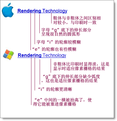
Now, the Windows version of Safari has been released. This software overcame many difficulties to implement Apple's font rendering algorithm on the Windows operating system. This actually gives you an opportunity to directly compare these two different font philosophies on the same monitor. It will help you understand the examples I am about to give. Through comparison, you will notice the differences. Fonts in the Apple system have a slightly fuzzy feel, with less clear boundaries. However, on the computer screen, it shows more variations between different font families. The reason is that Apple's rendering algorithm is more faithful to the original font design, and can present subtle differences in font design, like in high-definition printed materials.
...